Sales Experience Centre Design for a Residential Developer
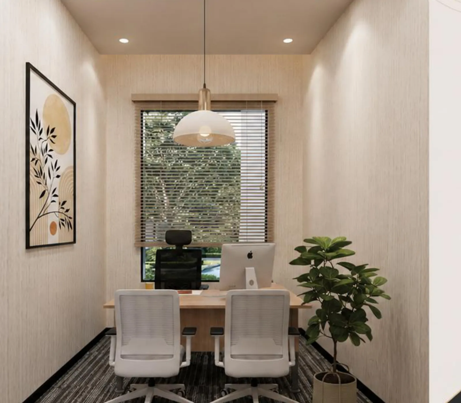
A design study for a residential developer's sales experience centre: a cafe-style waiting lounge, four meeting spaces from a three-seat nook to a twelve-seat conference room, a sales head's cabin and nine sales desks — every room sized on plan and given its own lighting design, because this is a building whose only job is to close a sale.
Concept design study. The layouts and views below are design proposals produced by Hagerstone's design team. They are not a record of a completed project, and the client is not identified.
By Dhruv Agarwal · · 5 min read
The brief
A sales experience centre for a residential developer — the building where buyers are received, shown the project, taken through a floor plan and, if it goes well, closed.
That makes it an unusual brief. An office is designed for the people who work in it every day; an experience centre is designed for a stranger's first twenty minutes. The staff accommodation is real and has to work, but it is fitted around the visitor's route rather than the other way round.
Every room sized on plan
The study fixes room sizes and seat counts before any finish is chosen, which is the right order: a 1000 × 2100 mm table needs a room of a certain size, and finding that out later is how meeting rooms end up with chairs that cannot be pulled out.
| Room | Size on plan | Seats |
|---|---|---|
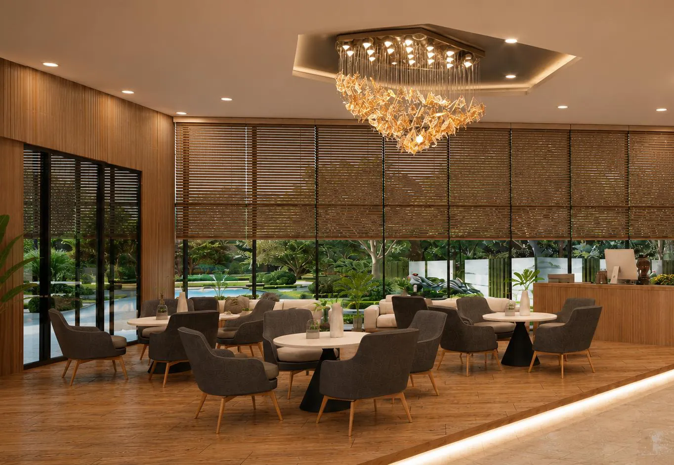
| Cafe and lounge | 9200 × 6800 mm | 14 chairs, 5 tables, 2 sofas |
| Reception | 6200 × 4800 mm | 2 |
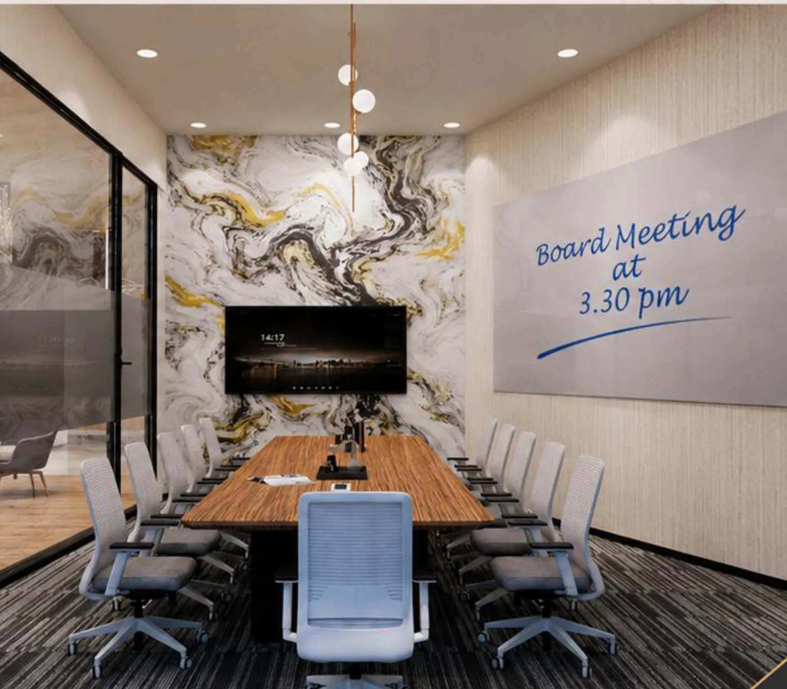
| Conference room | 4800 × 6800 mm | 11–12 around a 1200 × 3750 mm table |
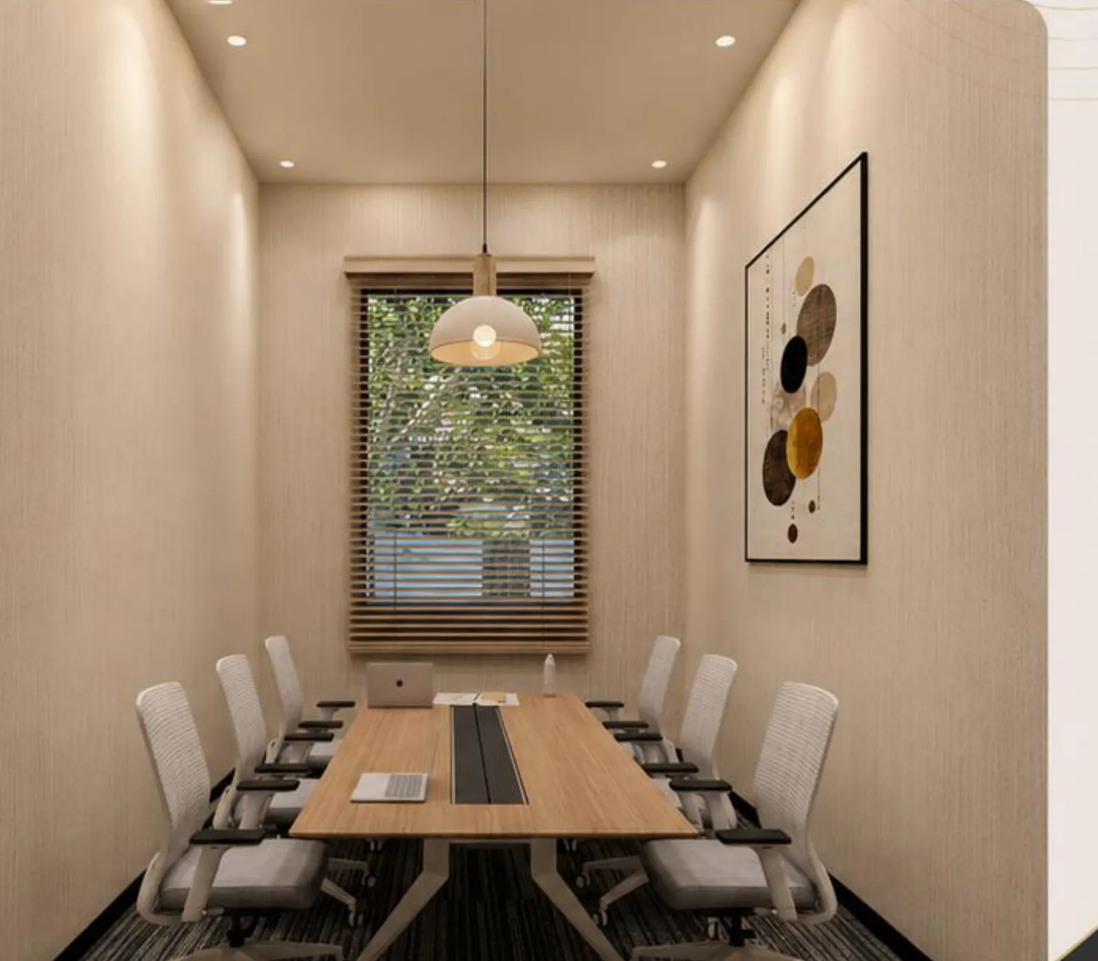
| Meeting room one | 3300 × 5400 mm | 6 around a 1000 × 2100 mm table |
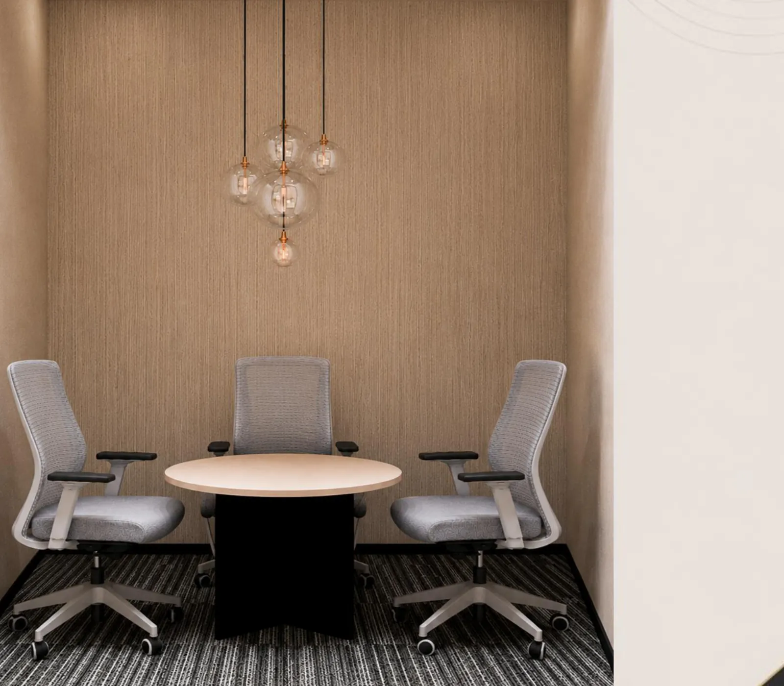
| Meeting nook | 2100 × 2700 mm | 3 |
| Sales head's cabin | 2500 × 3400 mm | Desk plus 2 visitors |
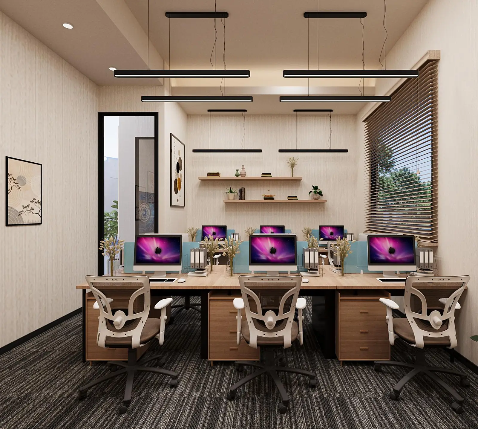
| Sales workstations | 5200 × 5800 mm | 9 desks, 6 pedestals |
| Private dining | — | 16 seats across 4 tables |
| Security cabin | — | 1 |
Read the meeting mix from the bottom up. The three-seat nook is the room that will work hardest, because most property conversations are one family and one salesperson. Without it, that couple ends up in the twelve-seat conference room, which changes the tone of a negotiation more than any finish does.
The arrival sequence
Three things have to happen in the first minute: the visitor sees the project, someone greets them, and they are given somewhere to sit that does not feel like a queue.
So the scale model sits in the arrival sightline but out of the walking route — visible on entry, walkable all the way round, without crossing the reception desk. The cafe does the waiting, with proper seating and a coffee counter rather than a row of chairs; a family with children will wait there without minding, and the salesperson gets a second, less formal place to talk. Both the model and the cafe get dedicated lighting, for the reason below.
A lighting plan per room
This is the part most fit-outs skip, and in a sales building it is the part that decides whether the finishes read as premium. Each room in the study carries its own plan rather than a general ceiling grid:
- A pendant over every table. Focused light on the surface where the conversation and the paperwork happen.
- Recessed downlights for the ambient level, so the room is evenly lit when the pendants are the only feature.
- Wall washers on the feature walls. Textured wallpaper, fluted panelling and stone only look like anything when light rakes across them. Lit flatly, an expensive wall reads as beige.
- Warm white at 3000K throughout, which keeps timber and stone warm. Cooler light makes the same materials look grey and the room look like a clinic.
- Anti-glare fittings at the sales desks, plus linear pendants over the bay — staff sit under these all day, which is a different requirement from a room a visitor uses once.
- A statement chandelier at reception and in the cafe. One per space, as the focal point; the rest of the lighting in those rooms is deliberately quiet.
Related: office lighting design · lighting power density
Finishes
A sales centre is a showroom for the developer's own standard of finish, so the palette leans warm and tactile rather than corporate:
| Element | Specified as |
|---|---|
| Floor, work areas | Carpet tile in a textured loop pile |
| Floor, front of house | Italian marble, with engineered wood in the cafe |
| Joinery and tables | Wood laminate in a walnut tone, matte black metal bases |
| Feature walls | Textured plain wallpaper, fluted oak panelling, marble-pattern panels |
| Ceilings | Gypsum with paint, dropped and blacked out where the lighting needs to disappear |
| Window treatment | Fabric blinds on every glazed elevation |
| Hardware | Satin stainless door furniture, heavy-duty floor springs on the glass doors |
Two choices are worth calling out. The walnut laminate is used on every table, desk and counter — one tone across the building, so the joinery reads as a set rather than a collection. And the ceilings are painted out in black where the track and pendant lighting sits, which makes the fittings read as intentional instead of as clutter.
Related: carpet tile · laminate and veneer · high pressure laminate · false ceilings and partitions
Outside the door
The study carries the arrival sequence out to the site, because a visitor forms an opinion before they reach reception. The facade uses ACP in a cocoa teak wood finish with travertine and textured paint, mosaic tile at the entrance, and paved driveway and parking blocks. The planting is chosen for structure and low maintenance in full sun — bougainvillea for colour, foxtail and travellers palms for height, cycas and bismarck palm for form.
Related: aluminium composite panel · cladding systems
What to settle before construction drawings
- Peak visitor load on a launch weekend, not an average day. It sizes the cafe, the parking and the number of small rooms.
- Whether the model is final. Its footprint sets the arrival layout, and models are often built after the interior is drawn.
- How long the centre will stand. A sales centre with a three-year life takes different partitioning and services decisions from a permanent building.
- Where staff park and enter. If sales staff arrive through the visitor entrance, the arrival sequence is compromised every morning.
- Signage and branding zones, so wall finishes and lighting are coordinated with them rather than cut into later.
Related: Cat A vs Cat B fit-out · demountable partitions
Taking it to site
We design and build these end to end — interiors, services, facade and landscape under one contract: office design and build · turnkey office fit-out · fit-out MEP coordination · residential developments · facade and glazing
Planning a sales centre or an experience centre? Send the shell drawings and your sales team headcount. Talk to the design team.
Four meeting spaces, four sizes
From a twelve-seat conference room down to a three-seat nook. Each one exists for a different conversation, which is what stops all four being used for the same one.
The sales floor
Nine desks and the sales head's cabin — the working half of the building, planned to stay visible without intruding on a negotiation.