NBFC Head Office Design: Three Layout Options, 68–204 Seats
A concept design study for an NBFC head office in Netaji Subhash Place, New Delhi. Three options were planned on the same floor plate: the interior study seats 170 at desks, while the source layouts push to between 190 and 204, and each option trades circulation and amenity against desk count.
Concept design study. The layouts and views below are design proposals produced by Hagerstone's design team. They are not a record of a completed project, and the client is not identified.
By Dhruv Agarwal · · 6 min read
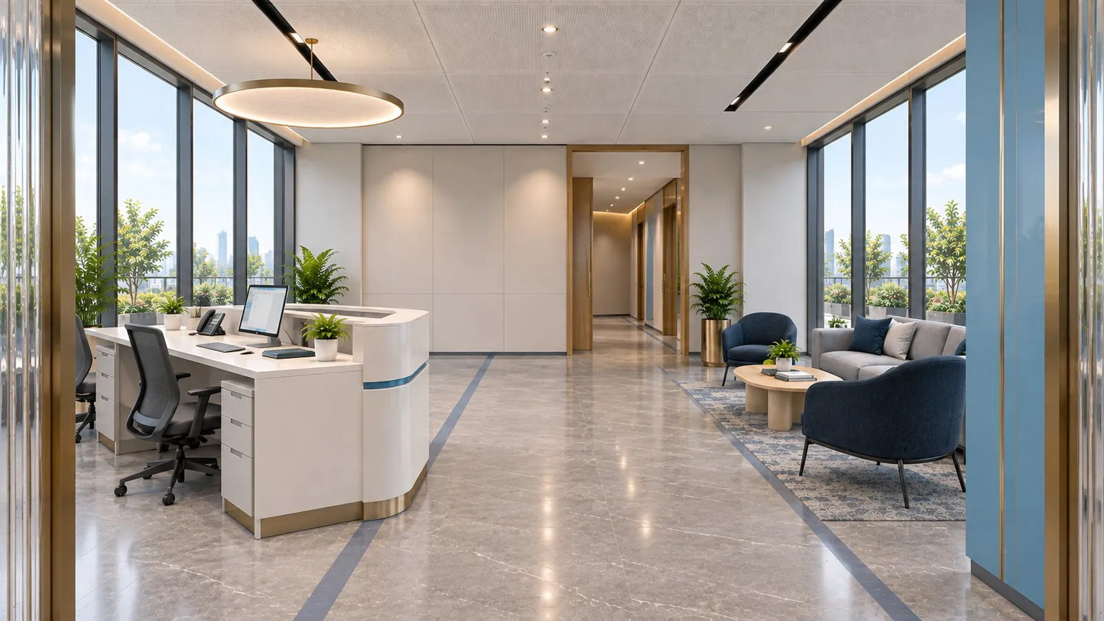
The brief
A financial-services occupier taking a single long floor plate in Netaji Subhash Place, New Delhi, for its head office. One floor had to hold the executive suite, the meeting and boardroom load a lending business runs, a client-facing lounge, and as many workstations as the plate would take without the floor becoming unpleasant to work on.
The plate is a deep rectangle with the core at one end. That geometry decides the plan before anyone draws furniture: the only sensible move is two long bands of desks either side of a single circulation spine, with the closed rooms gathered at the core end where the plate is interrupted anyway.
Three options were planned on the same shell, which is the useful part of this study — the differences are the decisions, not the drawing.
Three layouts at a glance
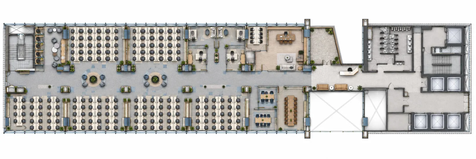
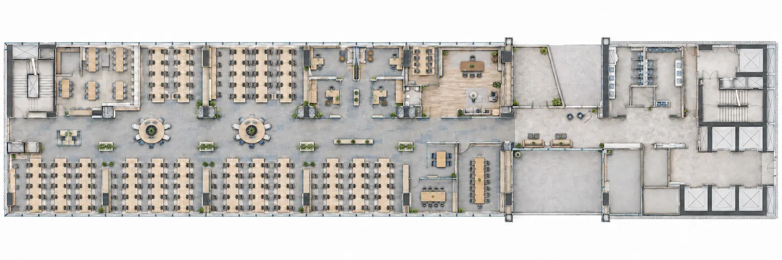
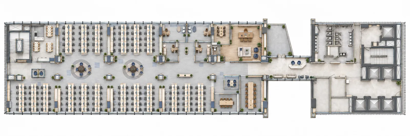
| Option 01 | Option 02 | Option 03 | |
|---|---|---|---|
| Workstation bands | Two, standard pitch | Two, tightened | Two, tightest pitch |
| Cafeteria seats | None — pantry and a short dining run | 45 | 23 |
| Boardroom | 16-seat | 16-seat | 16-seat |
| Enclosed meeting rooms | Four-seat + eight-seat | Same | Same |
| Cabins | MD suite, two directors, shared HR room | Same | Same |
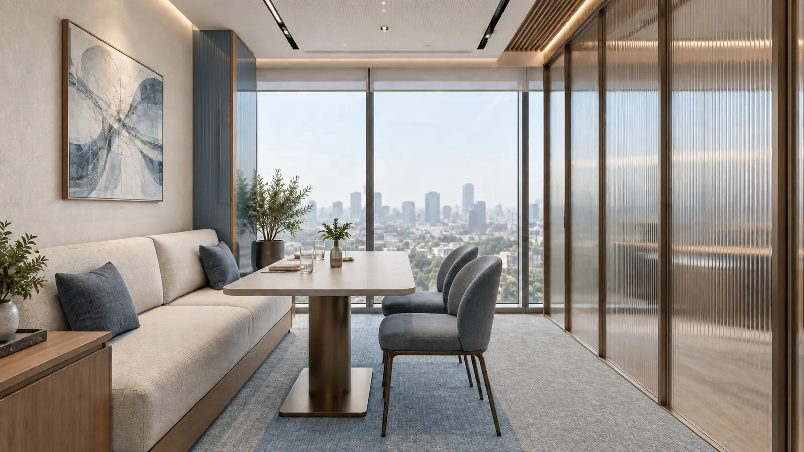
| Client lounge | Private lounge and dining for four | Same | Same |
| Call booths | Two | Two | Two |
| What it optimises for | Comfort and circulation | Staff amenity | Desk count |
| What it gives up | Desk count | Some desk pitch | Amenity space |
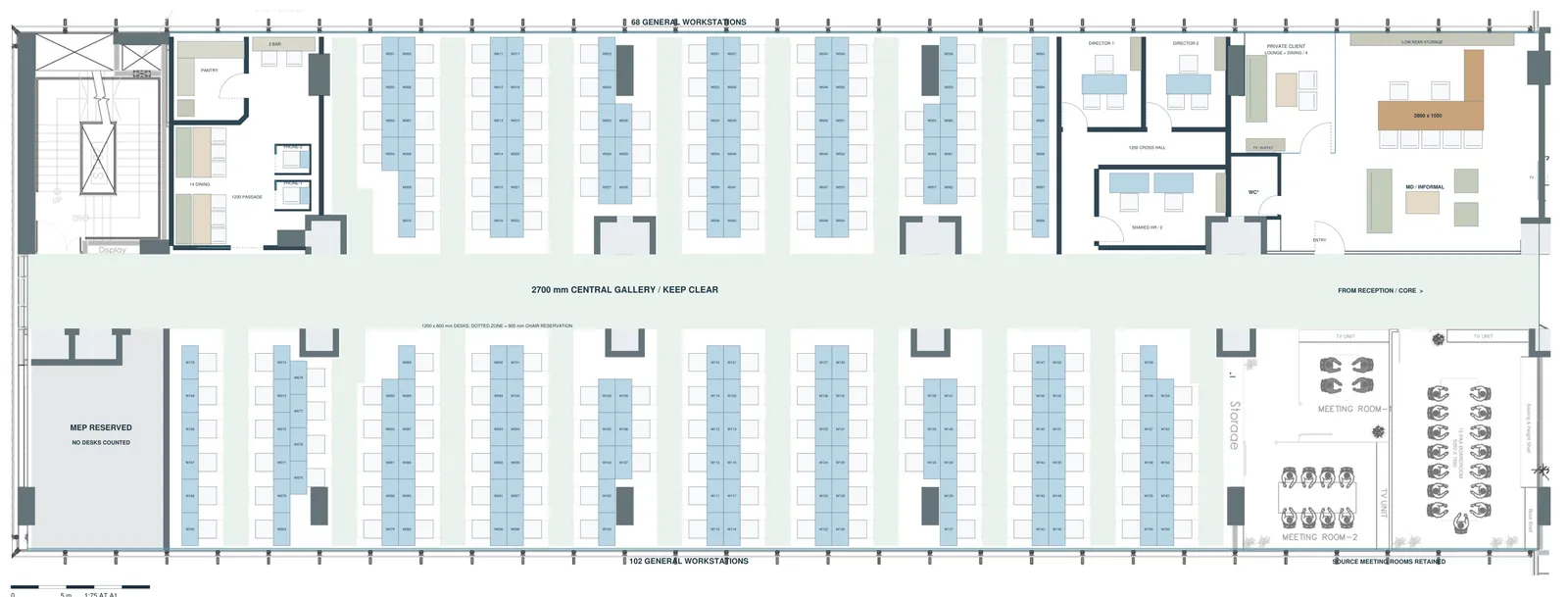
The workstation numbers are worth stating carefully. The interior study counts 68 desks in the upper band and 102 in the lower — 170 in total. The source layouts that sit behind options 02 and 03 annotate their workstation zones at 190 to 204. Both are true: they are different assumptions about pitch and about how much of the plate is conceded to circulation and services.
How the seat count changes the plan
The circulation spine is the first lever, and the one to protect. The plan holds a 2,700 mm central gallery and marks it keep clear. That is the width that lets two people pass a seated row without anyone moving, and it is also the route trolleys, fit-out material and eventually furniture take. Narrowing it is the fastest way to add desks and the fastest way to make a floor feel mean. If the gallery has to give, it should give locally — at a pinch point — not along its whole length.
Desks are 1,200 × 600 mm, with 900 mm behind each for the chair. The reference plan draws that chair zone as a dotted reservation rather than leaving it implied. This matters because a desk grid drawn without chair reservations always looks like it fits and never does, and the error only shows up when the furniture arrives.
Service zones must be excluded from the desk count. One area on the plan is marked MEP reserved — no desks counted. Excluding it is the honest thing to do: the electrical room, the shafts and the equipment runs are not negotiable, and a seat number that quietly includes them is a number that will fall by the time the services layout is real. This is the single most common reason a headline capacity figure turns out to be wrong.
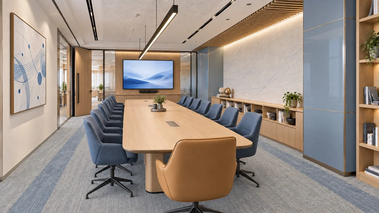
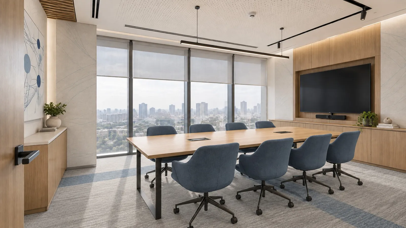
The meeting-room ratio drifts as density rises. The closed rooms stay the same across all three options — a 16-seat boardroom, an eight-seat room, a four-seat room and the client lounge — while the desks go up. At 170 desks that is a comfortable provision. At 204 it is tight, and the two call booths start doing real work, absorbing the one-to-one and video calls that would otherwise occupy a six-person room.
Closed rooms belong where the plate is already interrupted. Here the cabins, boardroom and lounge collect around the core, off a 1,200 mm cross hall. That keeps the window line available to the open floor, so daylight reaches the desks rather than being captured by a handful of offices — which in turn affects how the lighting and the glazing performance need to be specified.
Further reading: workstation density · carpet vs built-up area · workplace strategy and space planning
Finishes, and the logic behind them
| Area | Specified as | Why |
|---|---|---|
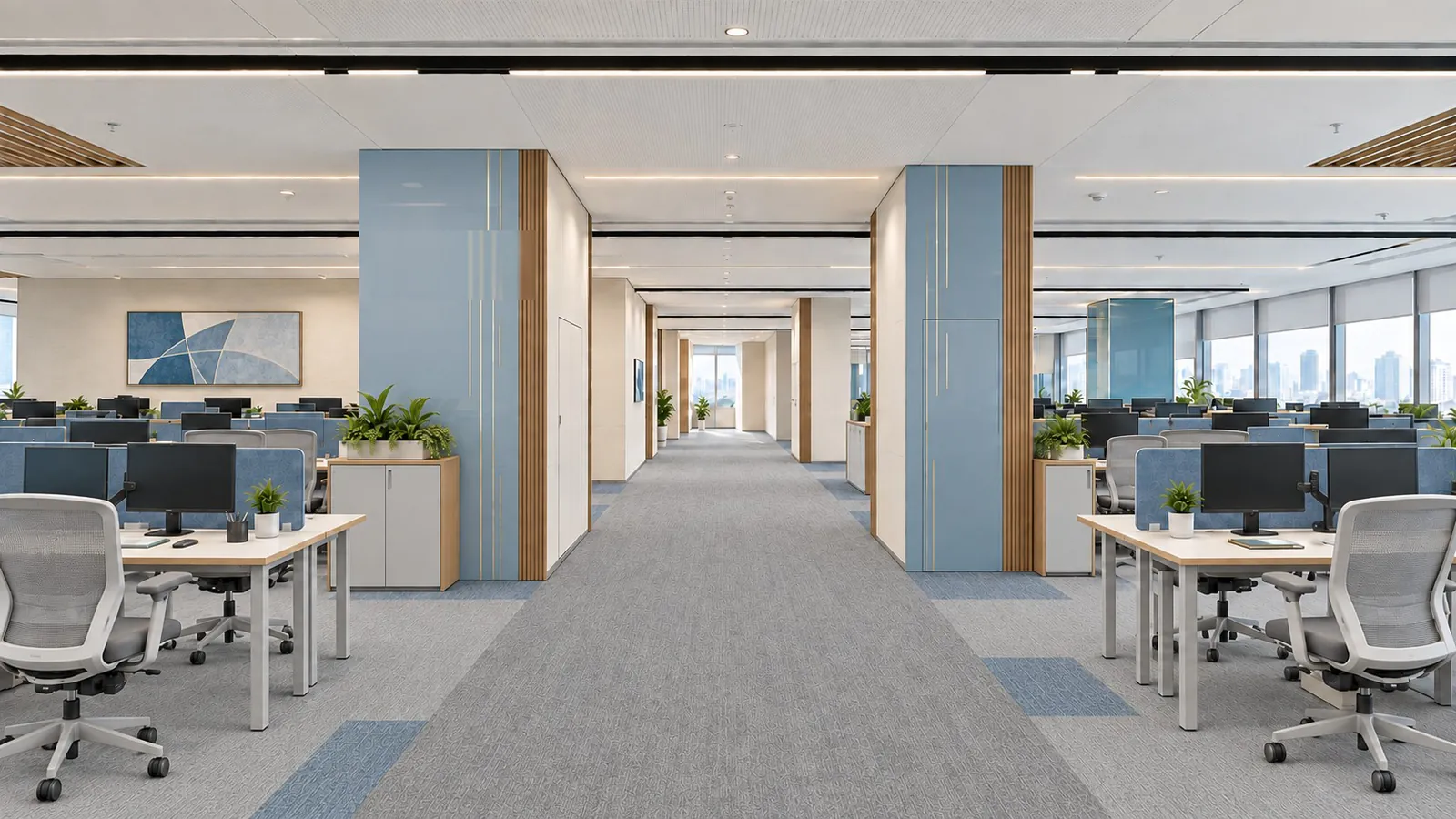
| Open floor | Carpet tile, main grey | Acoustic absorption underfoot, and tiles can be lifted for floor boxes |
| Circulation | Carpet tile, darker grey | Marks the route visually and wears where footfall is heaviest |
| Accents | Carpet tile, blue and indigo | Zoning without partitions |
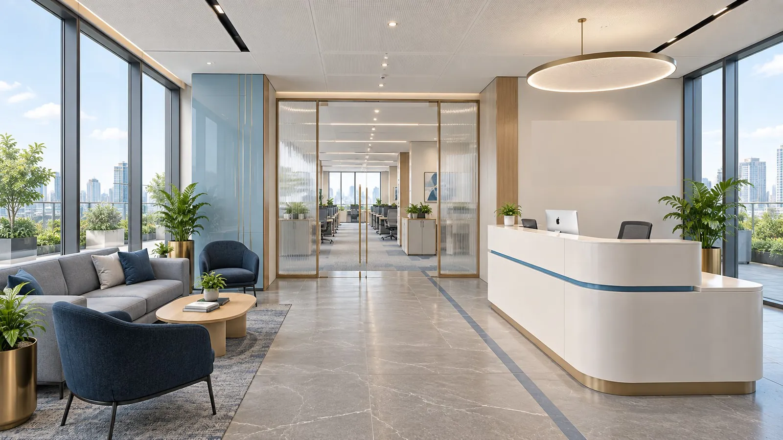
| Reception and lift lobby | Italian stone | The arrival surface takes the most traffic and is the first thing a visitor reads |
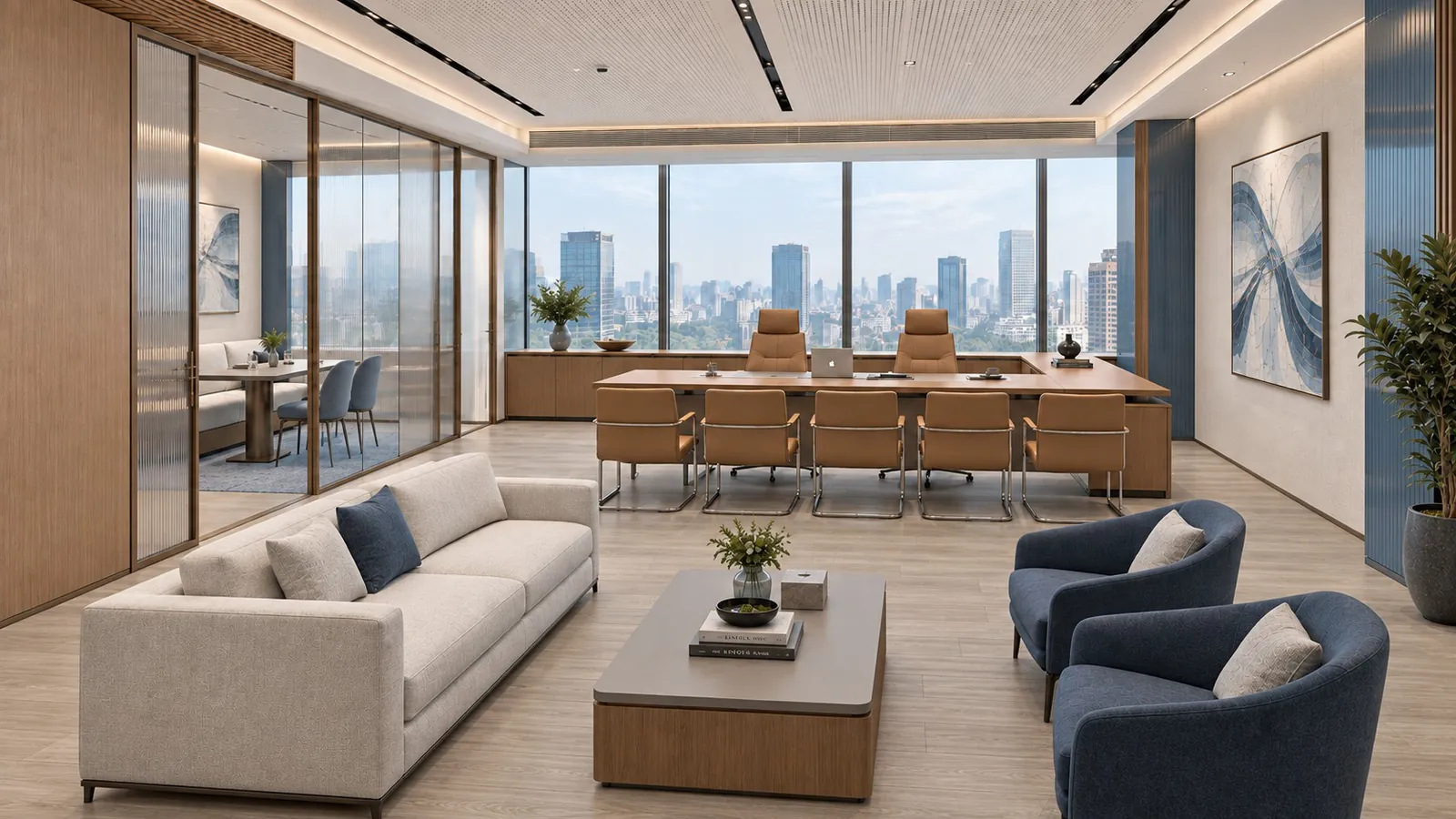
| MD cabin | Wood-look laminate flooring | Warmer register for the one room that is also a meeting space |
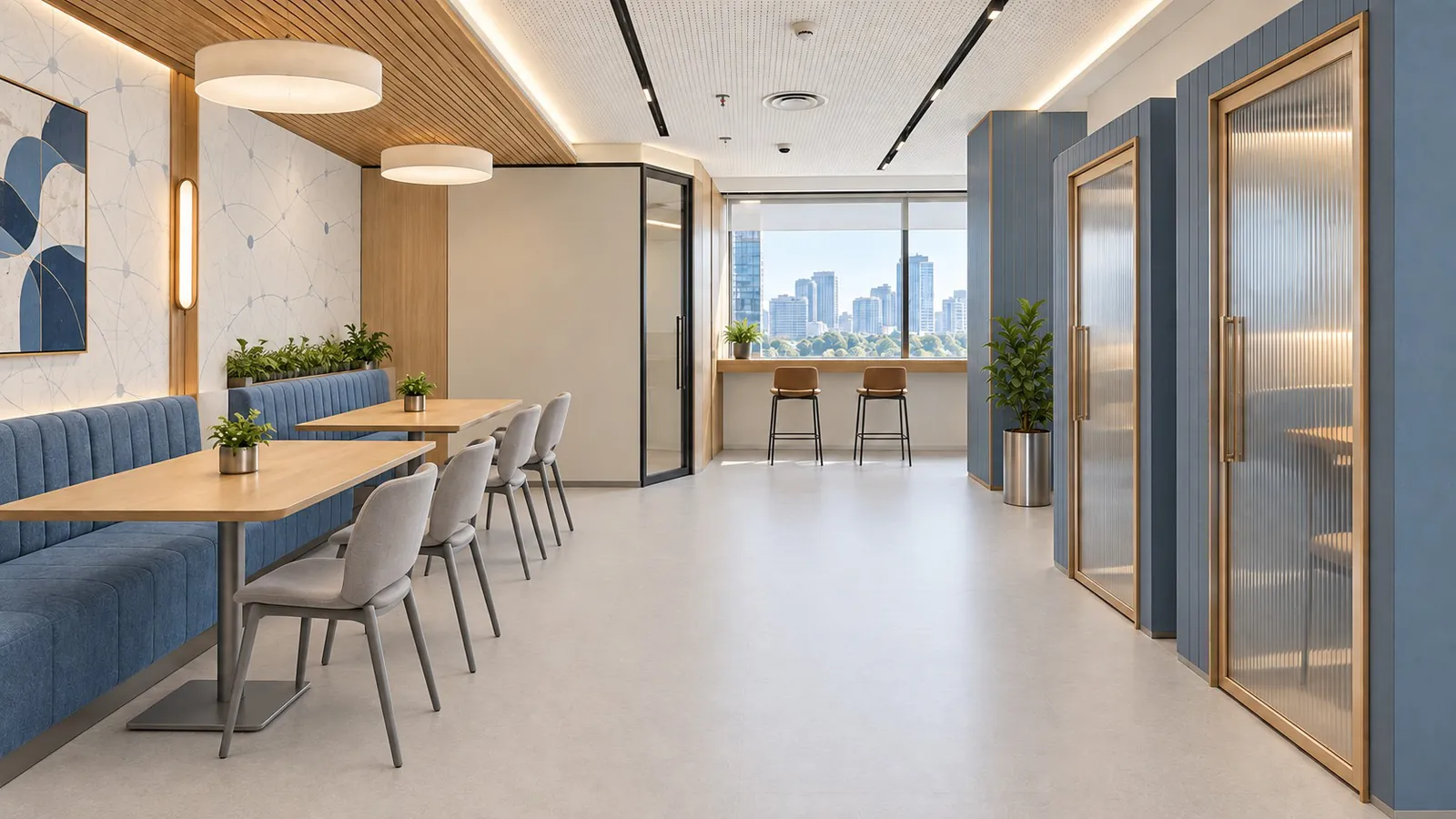
| Cafe and pantry | Easy-clean resilient finish | Specified for spills and daily cleaning, not for appearance |
Two details carry more weight than they look. All four carpet tiles come from one range, so backing thickness and pile height match at every junction — mixing ranges to chase a colour is how you end up with a visible step between two tiles. And the stone stops where the carpet starts, at a threshold the drawings locate deliberately; left to site, that junction lands wherever the tiler reaches at the end of a day.
Related: carpet tile · vitrified tile · laminate and veneer · natural stone cladding · flooring systems
What to settle before construction drawings start
- The headcount you are actually planning for, including growth. A plan optimised for today's number and a plan with 15% headroom are different plans, not the same plan with spare desks.
- How many closed rooms you genuinely need. Every cabin is desks, daylight and services. The honest test is how often the room is occupied, not who it belongs to.
- Whether the cafeteria is amenity or overflow seating. If people will work from it, it needs power, acoustic treatment and better lighting than a canteen.
- Services routes. This study still carries two open notes — circulation to coordinate, and wet services to confirm. Both are normal at concept stage and both must close before drawings go out, because a moved shaft moves partitions.
- Partition strategy against lease term. Demountable partitions cost more up front and can be relocated or removed; drywall is cheaper and permanent. The lease length usually decides this, not the budget.
- What the base building gives you. Corridor widths, the glazing specification and the services capacity are fixed by the building. Design starts from them.
Related: Cat A vs Cat B fit-out · demountable partitions · false ceilings and partitions
Taking a layout to a built floor
A layout study is the cheapest stage to change your mind in. After it come the construction drawings, the services coordination and the build itself — and the layout decisions above are what those stages inherit.
We work as a single contract across design and delivery: office design and build · turnkey office fit-out · fit-out MEP coordination · corporate office interiors · projects in Delhi
Have a floor plate and a headcount? Send both and we will plan options the same way. Talk to the design team.
The three layout options
Same floor plate, three planning decisions. Read them against the table above: what each option adds, and what it gives up to get there.
The interior study, desk by desk
Every workstation numbered, the central gallery dimensioned, and the service zone marked as excluded from the count — this is the drawing a seat number should be argued from.
Interior views
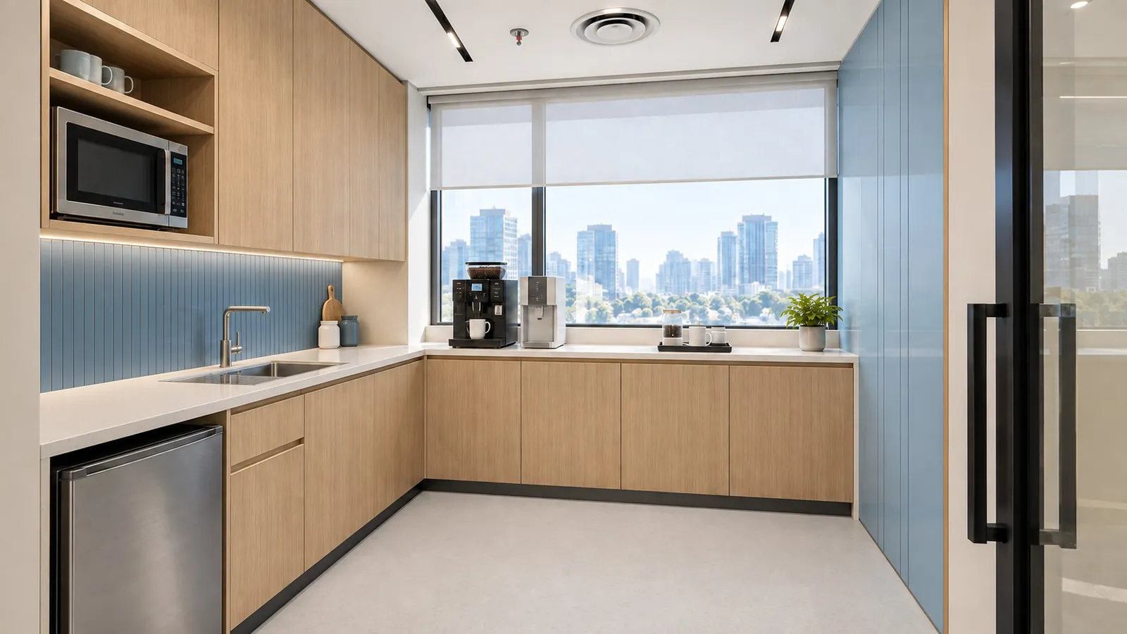
Design visualisations of the rooms the layouts create, from arrival through to the pantry.
Standards referenced
- NBC 2016, Part 4 — Fire and life safety — business occupancy
- ECBC 2017 — Energy Conservation Building Code