Corporate Office Design Across Two Floors of a Gurugram Tower
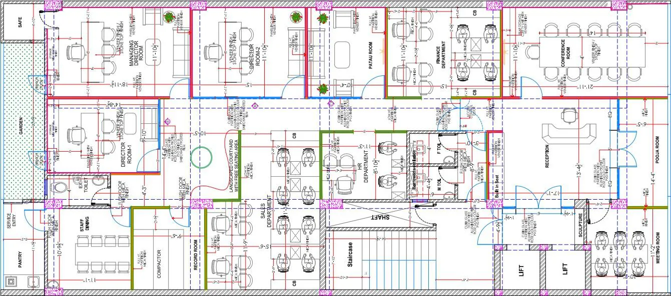
A two-floor corporate office design study in a Gurugram tower. Both floors repeat one plan logic — cabins along the glazed edge, departments in the middle, services at the core — and every principal room is drawn to elevation level, with each wall's panelling, veneer and beading specified before anything is built.
Concept design study. The layouts and views below are design proposals produced by Hagerstone's design team. They are not a record of a completed project, and the client is not identified.
By Dhruv Agarwal · · 5 min read
The brief
One company taking two floors of an office tower in Gurugram: directors, finance, HR and sales, with the meeting load and the amenities that go with them.
Two floors in the same building is a different problem from two floors in two buildings. The lifts, the core and the structure are fixed and identical, so the useful question is not how to make each floor distinctive — it is how much of one floor to repeat on the other.
Two floors, one logic
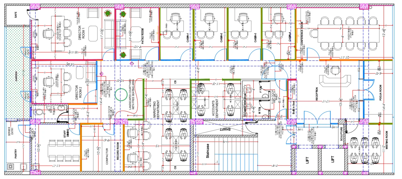
Both plans do the same three things:
- Cabins and director rooms along the glazed edge, where the daylight is.
- Departments in the middle, in low-partitioned blocks: finance and HR on one floor, sales and accounts on the other.
- Services at the core — lifts, staircase, shaft, toilets — with reception facing them.
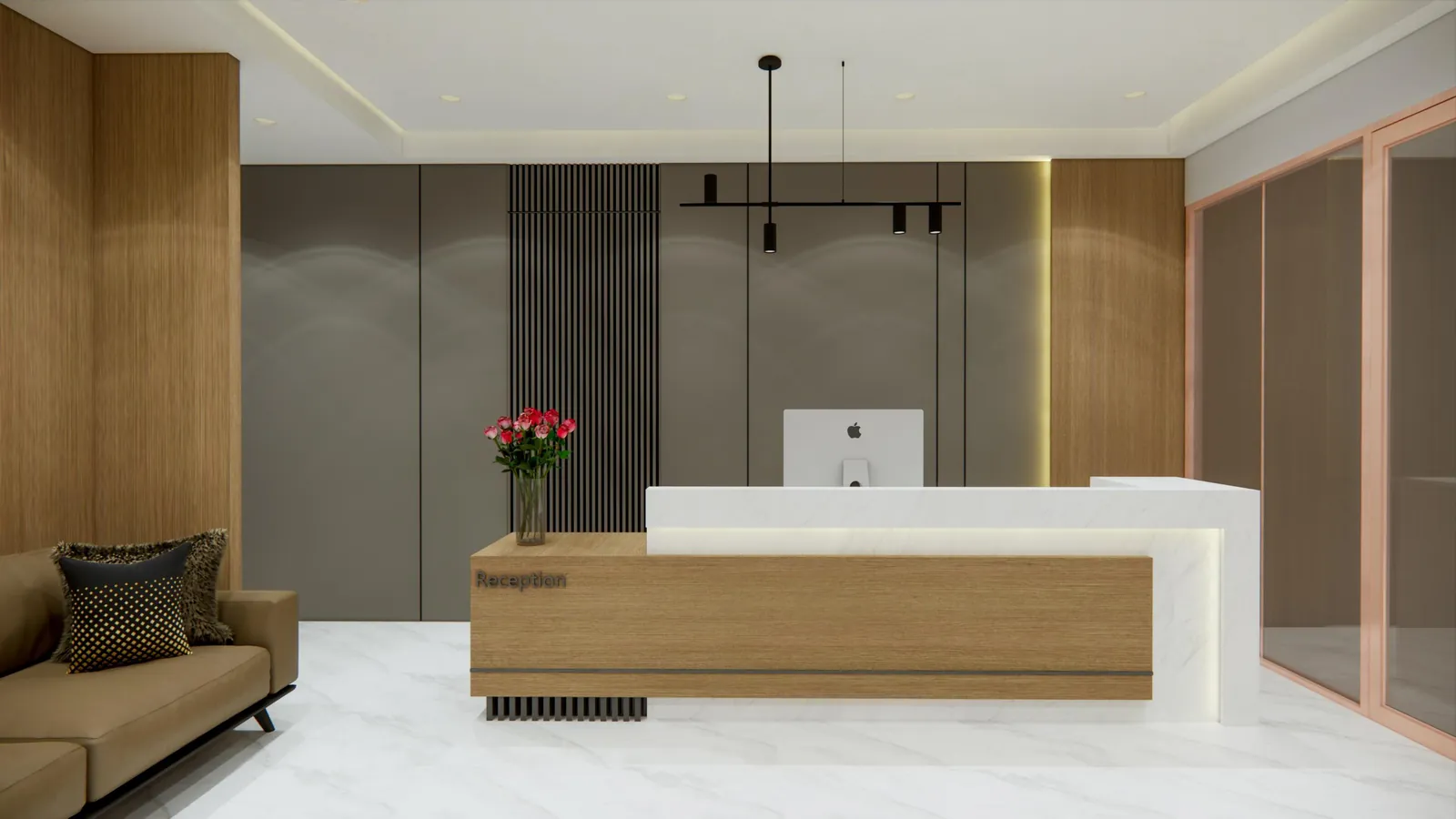
Repeating that logic is worth more than variety. Anyone who learns one floor already knows the other: the conference room is off reception on both, the pantry is by the core on both, and the toilets are in the same place. What changes is only which departments sit where, and which floor carries the main conference room.
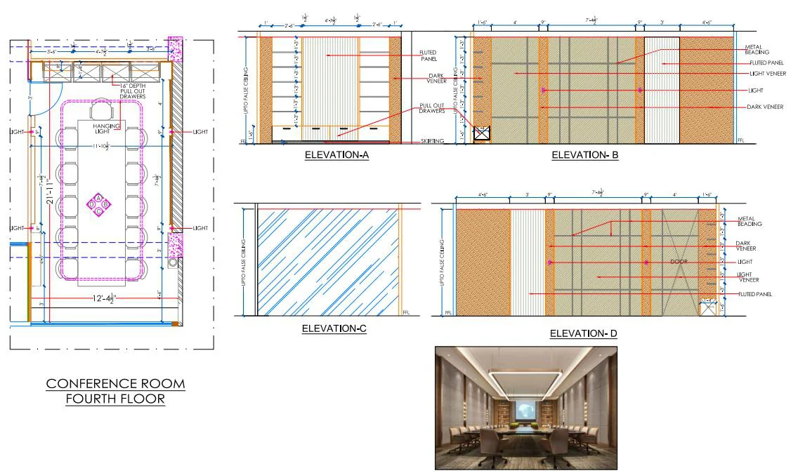
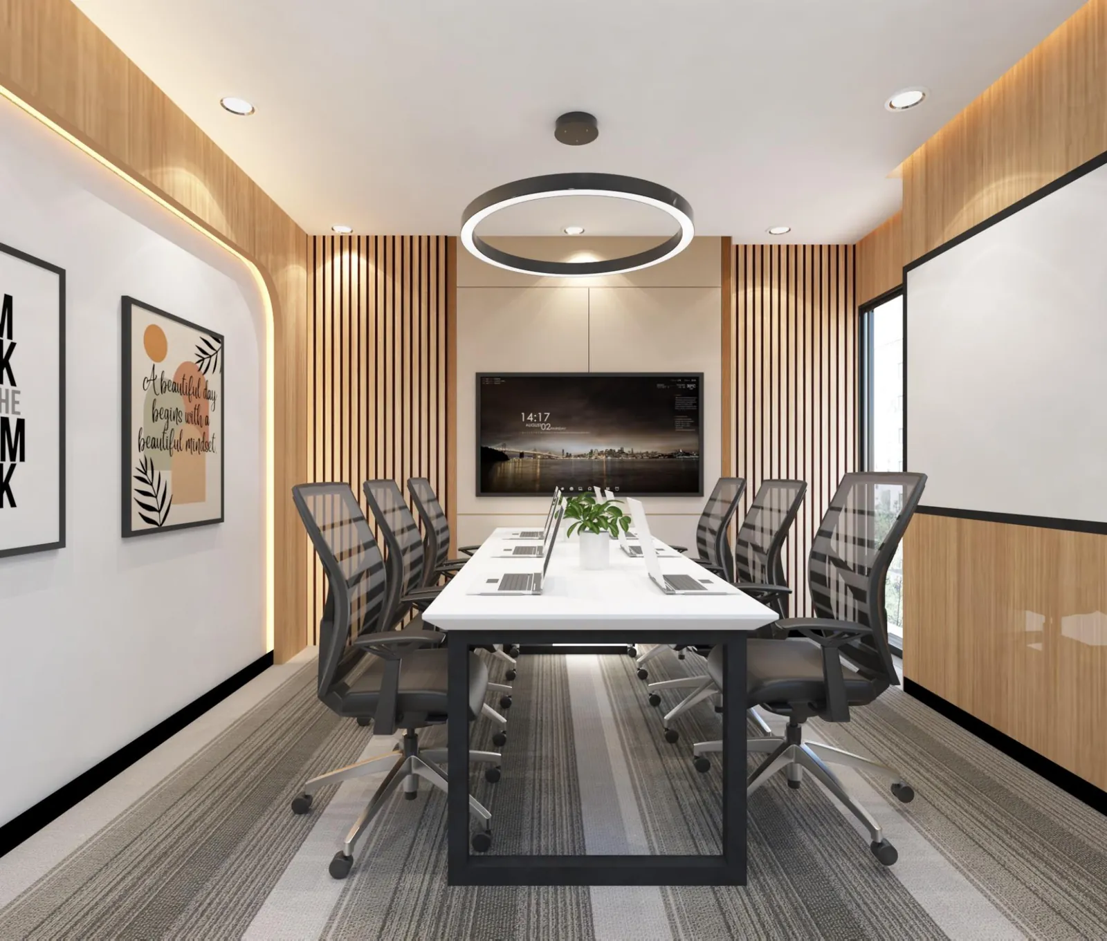
Dimensions are drawn in feet and inches, as most fit-out drawings in this market still are: the conference room at roughly 21 ft 11 in by 14 ft, the meeting room at 11 ft 2 in by 10 ft 2 in, an HR department block at 11 ft 3 in by 8 ft 10 in, reception at about 13 ft by 17 ft with a built-in seat rather than a separate waiting room.
Related: offices in Gurugram · corporate offices
Drawn to elevation level
This is the part worth borrowing from, whoever designs your office.
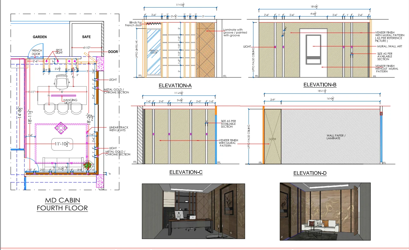
Each principal room here is drawn twice: a furniture plan, and then every wall it has as elevations A, B, C and D, with the finishes marked on each one — fluted panel, dark veneer, light panel, metal beading, laminate, veneer with a mural pattern. The conference room and the MD cabin both get a full sheet.
The difference is not presentational. A rendered view tells you the intent; an elevation tells a carpenter where the joint falls, how tall the panelling runs and which side the beading sits on. Where only views exist, those decisions get made on site by whoever is standing there — and they are then paid for twice, once in material and once in rework.
It is also how you find problems early. Drawing the MD cabin's four walls is what forces the questions of where the safe goes, how the planted corner is served, and whether the door swings into the visitor chair.
Partitions: three types, on purpose
The plan marks three different partition systems, and the mix is the design:
| Where | What | Why |
|---|---|---|
| Cabins and conference room | Full-height partition, veneer finish | Acoustic separation for rooms where confidentiality matters |
| Department blocks | Low-height partition, mica finish | Defines a team without sealing it, and keeps sightlines across the floor |
| Reception, meeting room edges | Glass partition, slim aluminium profile in a rose-gold PVD finish | Borrows daylight from the glazed edge into the middle of the plate |
Using one type everywhere is what makes an office feel either sealed or exposed. The drawings also mark an access-controlled door into one department, and borrowed ventilation for the internal toilets — both decisions that have to be made with the services layout rather than after it.
Related: glass partitions and doors · demountable partitions · laminate and veneer · false ceilings and partitions
The rooms most plans leave out
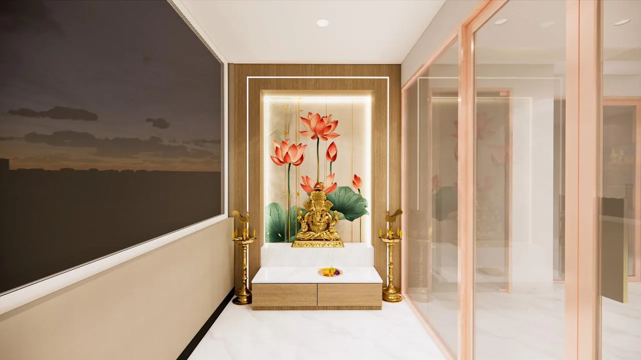
A pooja room with its own door. About 14 feet across, off the reception end, with a backlit niche and a stone platform. It is on the plan from the start, which is the only way it ends up as a room rather than a shelf in a store.
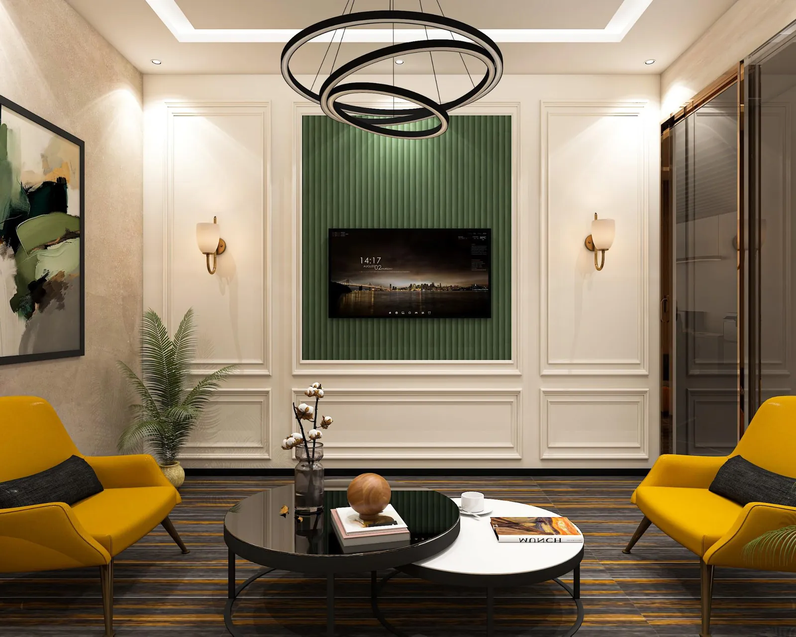
An executive lounge. Panelled, with armchairs and a low table, for the conversation that happens before a meeting starts or after it ends. In its absence that conversation occupies the conference room for another half hour.
A sculpture niche at the lift lobby, marked on the plan. A small thing, but it means the first thing a visitor sees leaving the lift was designed rather than left over.
Cafeteria, pantry and the open floor
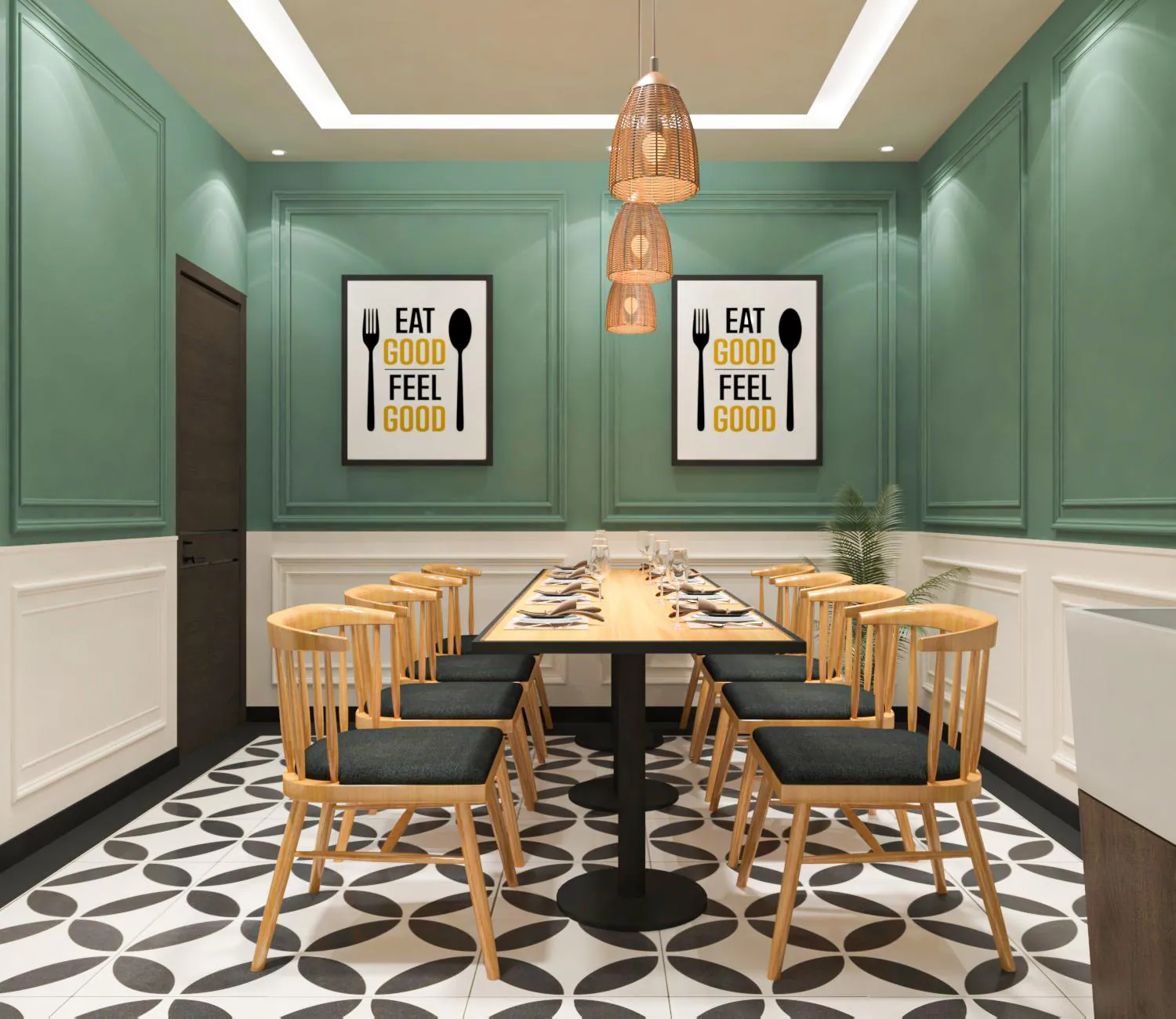
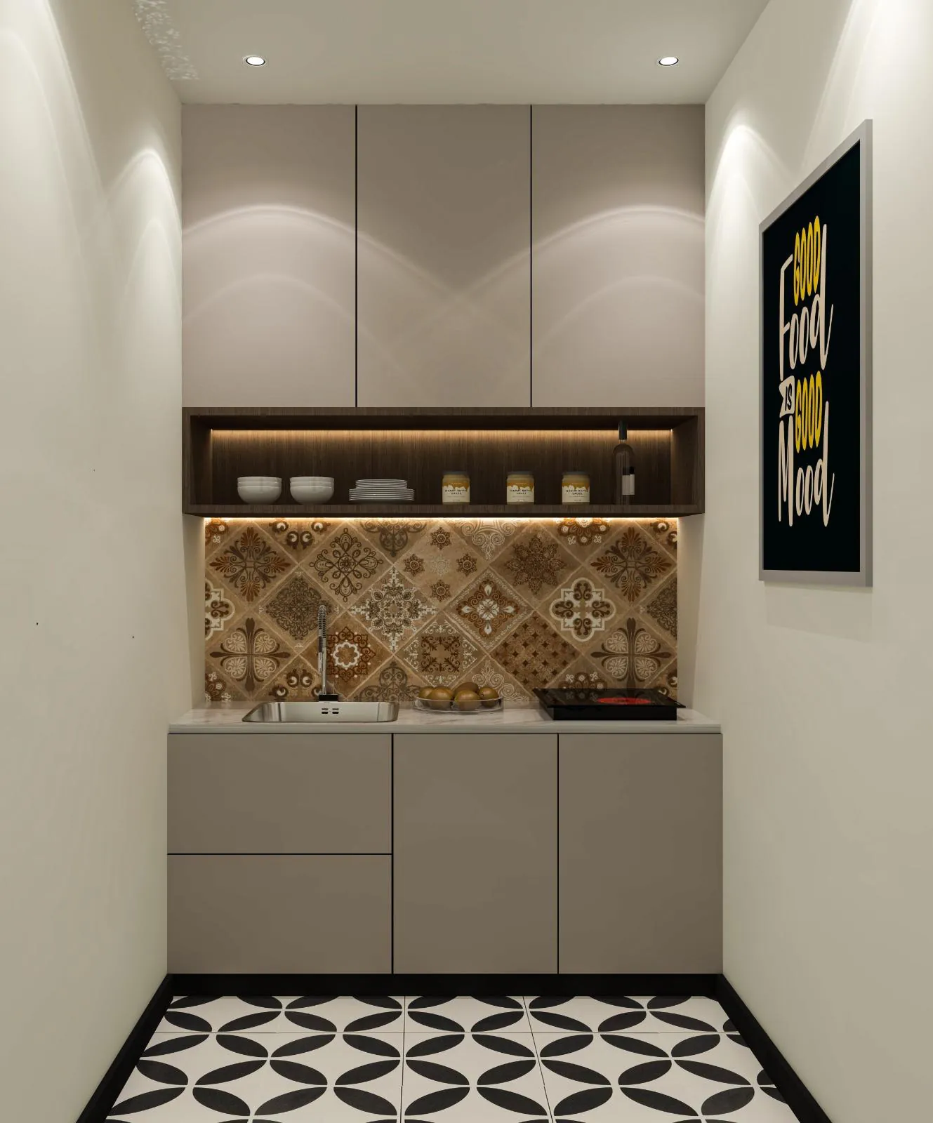
The cafeteria takes one long table instead of scattered fours — it seats more people in the same area and reads as one room. The pantry is separate, so tea service through the day does not cross lunch.
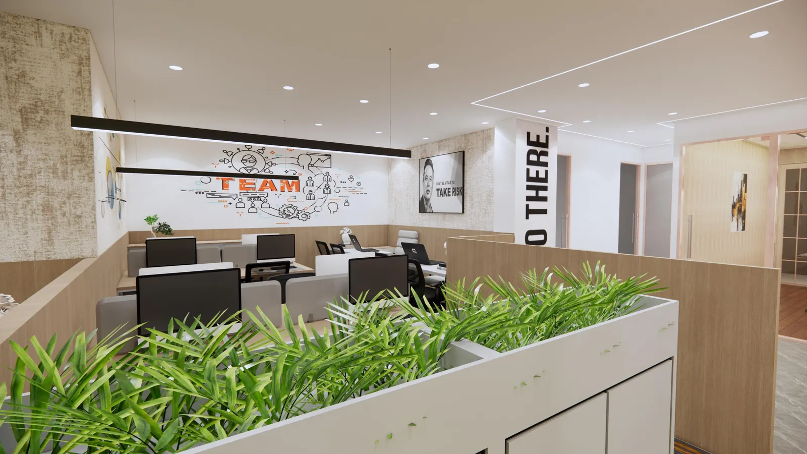
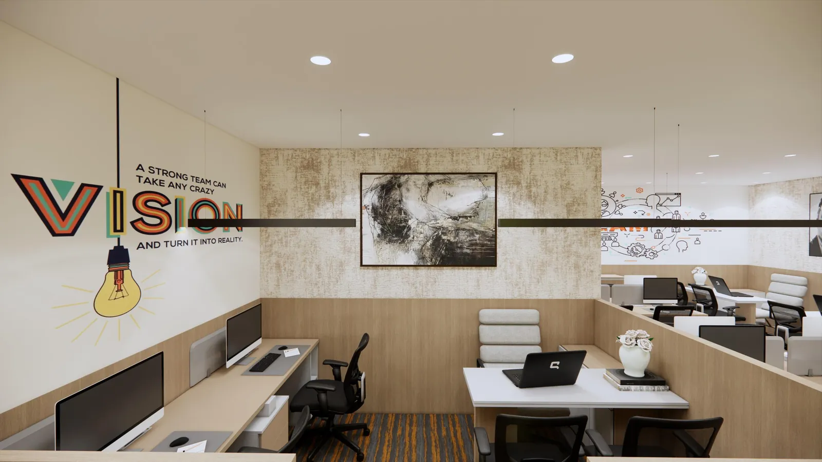
On the open floor, storage units topped with planting do the screening instead of desk partitions: privacy at seated height, greenery at standing height, and one piece of furniture doing two jobs. Where the plate runs deep and daylight thins out, wall graphics and a textured plaster finish give that side of the floor something to look at.
Related: workstations and office furniture · office lighting design
What to settle before construction drawings
- Which floor gets the main conference room, and therefore which floor visitors reach.
- Department adjacencies — finance next to HR is a different floor from finance next to sales, and moving a department later moves partitions and power.
- How much is drawn to elevation level. Every room is ideal; the principal rooms are the minimum.
- Access control: which doors, and who administers them.
- Ventilation routes for internal rooms, agreed with the services drawings.
- Whether both floors are built together. Phasing changes procurement and the site sequence more than it changes the design.
Taking it to site
We design and build both floors under one contract: office design and build · turnkey office fit-out · fit-out MEP coordination · offices in Gurugram
Taking space in a tower? Send the floor plate and your headcount. Talk to the design team.
Both floor plans
Two floors, one logic: cabins on the glazed edge, departments in the middle, lifts and services at the core.
Drawn to elevation level
Each principal room gets a furniture plan and all four wall elevations, with materials marked. This is the difference between a design that can be priced and a design that has to be decided on site.
Conference and meeting rooms
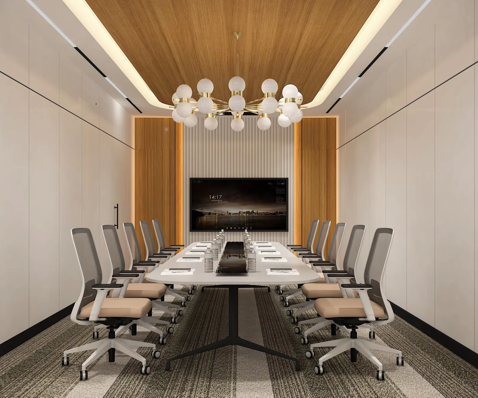
A long conference room for full sessions, and a smaller room off reception for visitors.
The rooms most plans forget
A pooja room with a door of its own, and an executive lounge for the conversation either side of a meeting.
The open floor
Workstations screened by planting rather than partitions, with graphics where the plate runs deep.
Cafeteria and pantry
Kept separate on purpose, so tea service and lunch do not share a counter.